
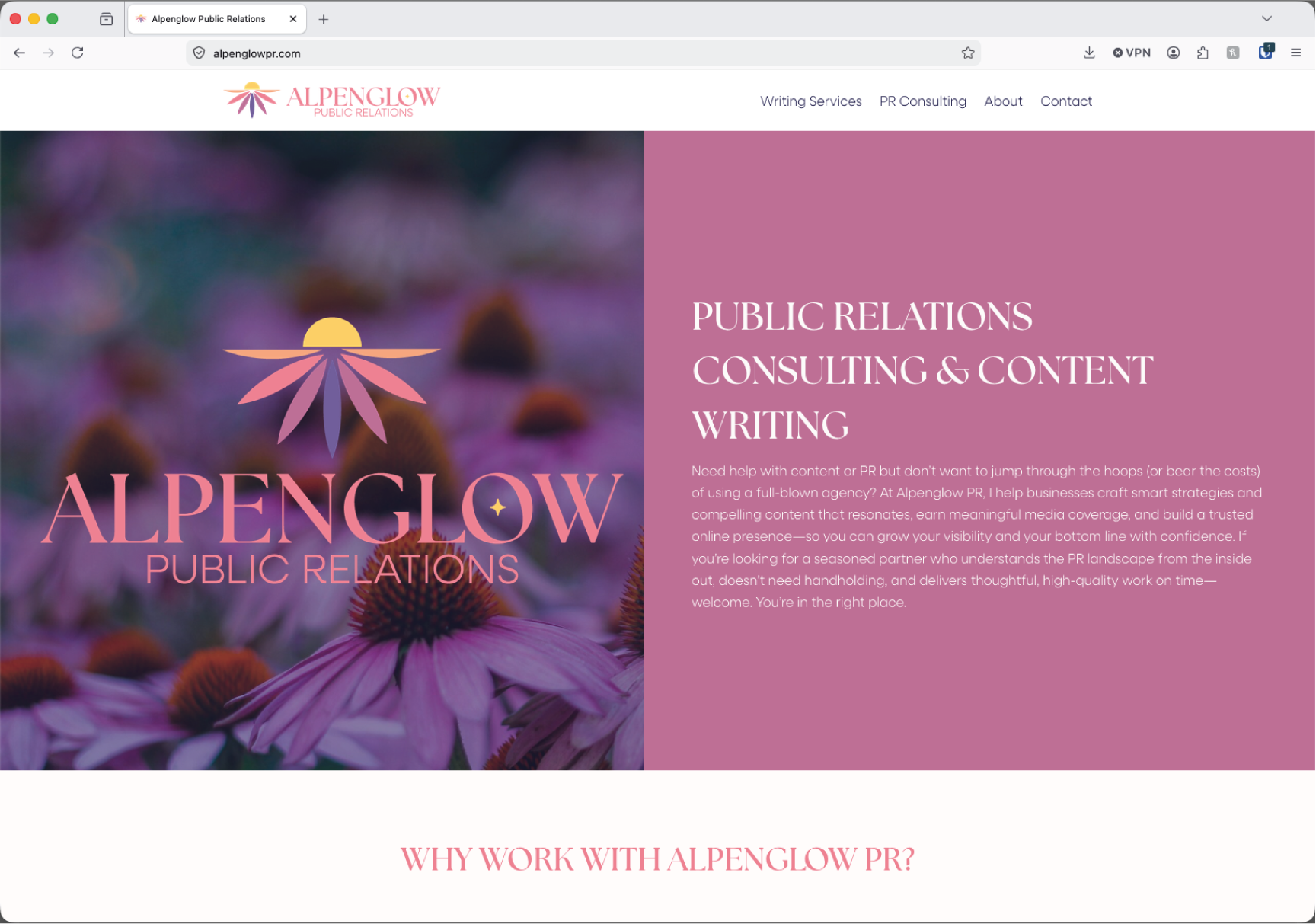
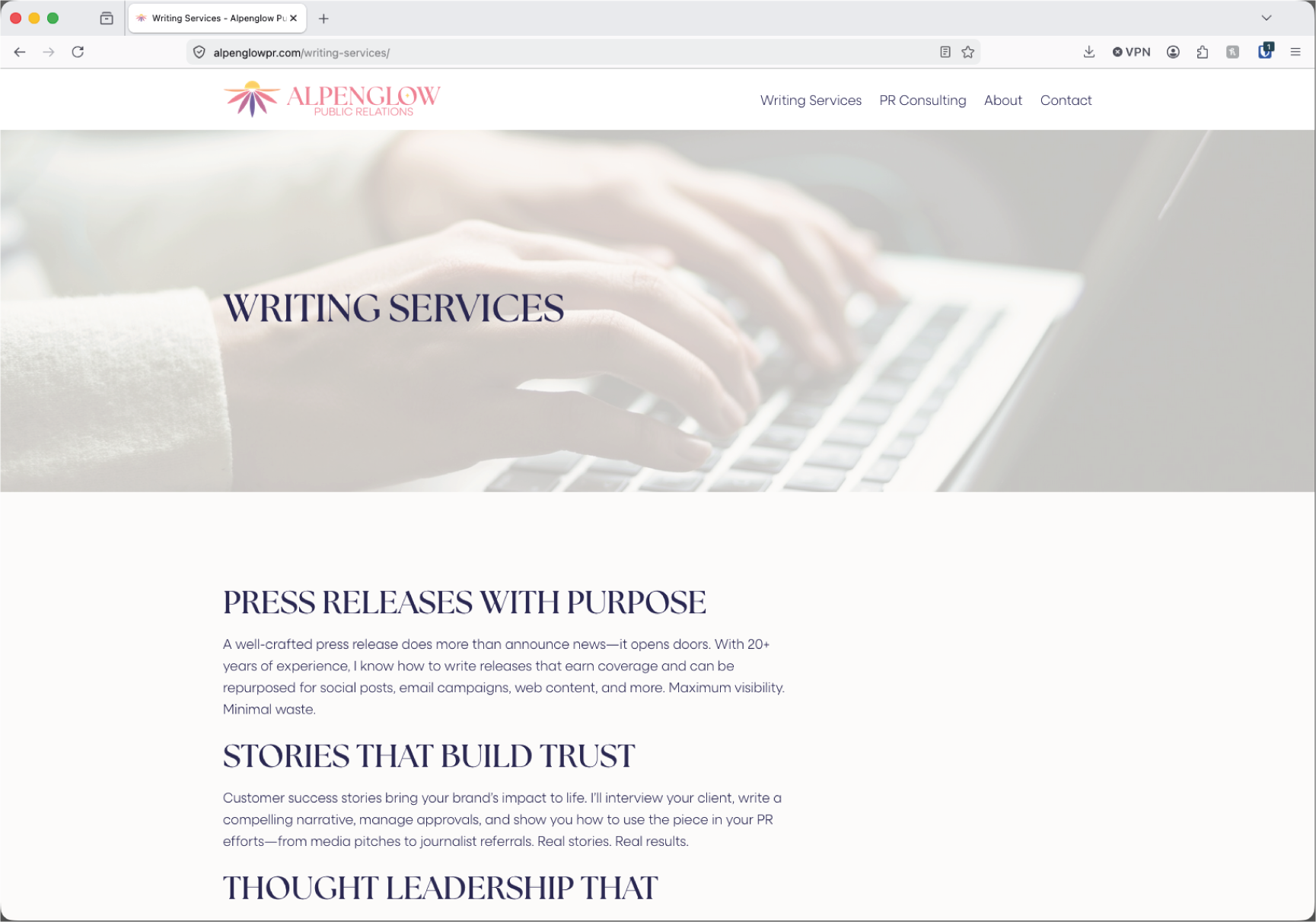
April was happy with her current website when we worked on the rebrand. She gave us updated content and we did minimal updates, new colors, fonts, and logo.

Alpenglow PR
Branding
2025
The Brief
After redefining the scope of her company, April Whitney came to Meadowlark Marketing to rebrand her company from April Whitney Custom Content to Alpenglow PR. Living in the mountains, April wanted to incorporate the beauty of alpenglow as well as her love for the Playful Meadow Mama echinacea flower. She also wanted to embody her business mantra “Understand Deeply, Explain Simply.” Once complete, translate the new branding to the website.
The Project
The natural shape of an echinacea flower lends itself to sunrise/sunset imagery. I wanted to utilize a simplified coneflower shape with the alpenglow colors. Living in the mountains, many people use mountain imagery in their branding and April wanted to avoid direct imagery so by applying the colors and concept to an echinacea flower, we created something that is representative both of April and the region where she lives.


Primary Logo
Stacked Logo Variation

Color Scheme

Round Logo Variation
Round Single-Color Logo Variation

Repeating Pattern

Original Branding Logo
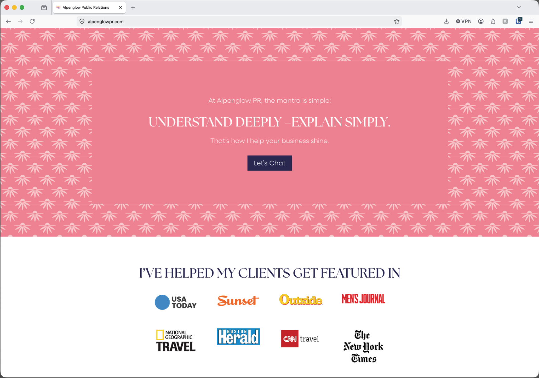
The repeating pattern displayed on the website.
Updated content and fonts.